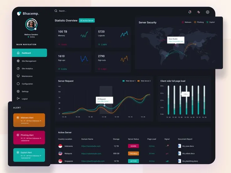
Watching the Wrong Numbers: How Your Dashboard Is Quietly Stalling Your Team
There's a Grafana board somewhere at your company that nobody fully understands but everyone trusts. It's got colorful graphs, a few alarming spikes that turned out to be nothing, and at least one metric that someone added two years ago and no one has questioned since. It looks like control. It feels like visibility. And it might be making your team measurably worse at shipping.
This isn't a post about bad tooling. The tooling is usually fine. It's about the habit of measuring things because they're easy to measure — and then letting those numbers drive decisions that have nothing to do with actual progress.
The Vanity Metric Trap
Response time is the classic offender. Teams spend entire sprint cycles chasing p99 latency numbers that, in practice, affect a fraction of a percent of real users. The graph looks bad, so engineers drop everything to optimize a cold path that fires three times a day. Meanwhile, a genuinely broken onboarding flow that kills conversion weekly goes untouched because there's no chart for it.
CPU usage is another one. It's visible, it's dramatic, and it spikes in ways that feel urgent. But high CPU on a server that's handling load correctly isn't a problem — it's the machine doing its job. The teams that treat every CPU spike as a fire drill end up building elaborate autoscaling rigs for workloads that would've been fine on a slightly bigger box.
Deployment frequency gets a pass because it sounds like a DORA metric, which means it carries the weight of industry authority. But frequency without context is noise. Shipping twenty times a day means nothing if half those deploys are config tweaks and the other half are hotfixes for yesterday's bugs. Frequency divorced from impact is just activity theater.
Why We Keep Measuring the Wrong Things
The uncomfortable truth is that the metrics teams gravitate toward are the ones that are easy to surface, not the ones that are meaningful. Infrastructure metrics are cheap to collect. Response times, error rates, CPU — these flow naturally out of your existing stack. You don't have to instrument anything special. You just wire up a dashboard and it looks like you've got your finger on the pulse.
Meanwhile, the metrics that actually correlate with shipping velocity require work to define and discipline to maintain. How long does it take from an idea being approved to code hitting production? What percentage of shipped features get used within 30 days? How often does a team's estimate match reality within a reasonable margin? These numbers are harder to collect, harder to visualize, and way harder to explain in a Monday standup. So they don't get tracked.
There's also a psychological component. Dashboards full of numbers create a feeling of competence. You're monitoring. You're aware. You're on top of it. That feeling is addictive, and it can substitute for the harder work of actually deciding what matters and making tradeoffs.
What Actually Moves the Needle
For teams that are trying to ship fast and learn quickly — which is basically the whole point if you're building in the early-adopter space — the metrics worth your attention tend to cluster around a few honest questions.
Time to production. Not deployment frequency. Actual calendar time from when a piece of work is committed to when it's live and accessible to users. Long lead times are a symptom of process friction, unclear ownership, or scope creep. Tracking this number forces those conversations.
Feature adoption rate. Did the thing you shipped get used? This one stings, because it means your dashboard has to include data from outside your infrastructure. You need product analytics, not just server metrics. But it's the only way to know if you're building the right things or just building things.
Rollback rate. How often does a deploy get pulled back within 48 hours? This is a proxy for code quality, review rigor, and testing coverage — without requiring you to instrument any of those things directly. A rising rollback rate is a genuine warning signal. A low one is a genuine green light.
Mean time to recovery, not mean time between failures. Systems fail. The question is how fast you get back. Teams that optimize for resilience and fast recovery outperform teams that optimize for uptime percentage, because the latter is often a vanity target that leads to over-engineering and slow deploys.
The Optimization Cycle That Kills Momentum
Here's what the wrong metrics actually cost you in practice. A team sees a metric that looks off. It's not causing any user-visible problems, but it's outside the threshold someone set six months ago. An engineer gets assigned to investigate. The investigation takes two days. They find that the metric is technically fine and the threshold was set arbitrarily. They adjust the threshold and close the ticket. Nothing ships.
Multiply that by a few times a month and you've got a team that's perpetually busy but not making forward progress. The dashboard created work that looked like engineering but was actually just maintenance of the monitoring system itself.
The fix isn't to stop monitoring. It's to be ruthless about which metrics are allowed to generate action. If a number can't directly answer the question "should we ship this or not" or "is this actively hurting users right now," it probably shouldn't be in your primary view.
Trimming the Dashboard
A useful exercise: print out your current dashboard (or screenshot it, nobody's printing anything). Go through each panel and write down the last time that metric changed a decision your team made. If you can't remember a specific instance, that panel is probably decoration.
The goal isn't a sparse dashboard for the sake of minimalism. It's a dashboard where every number earns its space by being genuinely actionable. That's a much higher bar than "interesting" or "good to know."
Teams that ship consistently tend to have a surprisingly small set of metrics they actually watch. Not because they're unsophisticated, but because they've done the work of figuring out which numbers map to outcomes and which ones just map to more numbers.
Ship First, Optimize With Evidence
The early-adopter mindset is fundamentally about moving before you have perfect information. That extends to metrics. You don't need a complete measurement system before you ship — you need enough signal to know if something is broken and enough product data to know if something is working.
Start with a short list. Add a metric only when you can articulate exactly what decision it will inform. Delete the ones that haven't driven a decision in the last quarter. Your dashboard should feel slightly uncomfortable in its simplicity — that discomfort usually means you've cut the right things.
The goal was never to watch the numbers. The goal was to ship something people use. Make sure your metrics are pointed at that target and not just at each other.